On Designing for the Overmind Brand
by
Leon Brown
Work

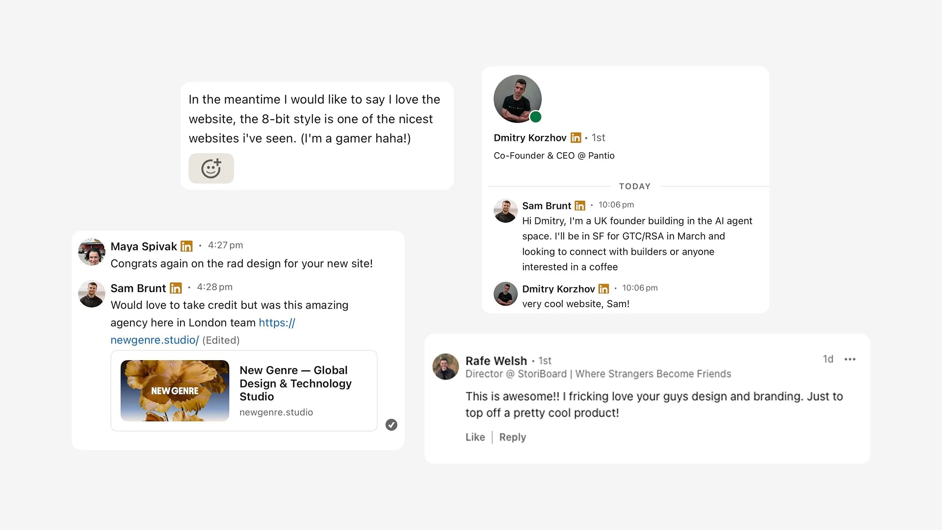
And giving life to the weirdest, most creative clients we’ve ever had.
There's a particular kind of luck that comes along with receiving a brief that arrives without a map. Sam and Tyler came to us with an excitement for building a product they called Overmind — an AI-building copilot handling the unglamorous, essential work of AI-model development: scoring “traces”, preprocessing “data”, and fine-tuning systems that increasingly run themselves.
The category they were building for barely had a name yet. There was no established visual language to subvert, and no obvious competitor to differentiate against. Just two founders who understood their technology with total clarity, and luckily for us, a market that hadn't yet decided what agentic tooling was supposed to feel like.
Most of our briefs are really repositioning exercises — finding the gap between what exists and to do something adjacent to it. In a turn of luck, Overmind offered no such scaffolding. The brand challenge wasn't differentiation, but instead origination. Here’s how we designed for it.
On mythos, not minimalism
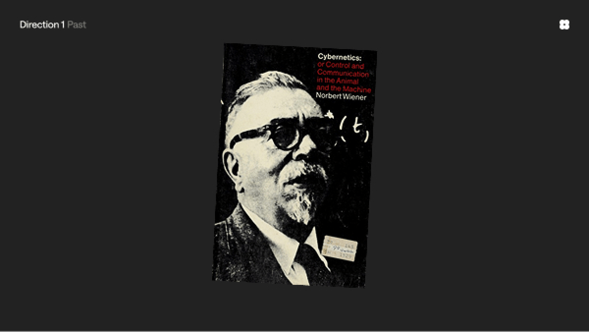
We had to decide, quickly, and with conviction, what Overmind meant before we could decide what it looked like. We pattern-noticed an instinct in tech branding — particularly in anything adjacent to cybersecurity or AI — to retreat into a familiar register of dark backgrounds, Inter, kerned tightly, and a kind of restrained visual sterility that reads as "serious business" because it withholds personality.
We agreed with Tyler and Sam almost immediately that it was the wrong instinct for our collaboration. What they felt was that sterility doesn't build trust with developers, and their exercise, in the early stages of growth, is a movement in recognition and what I’ve coined “Maximum Brain Stickiness”.
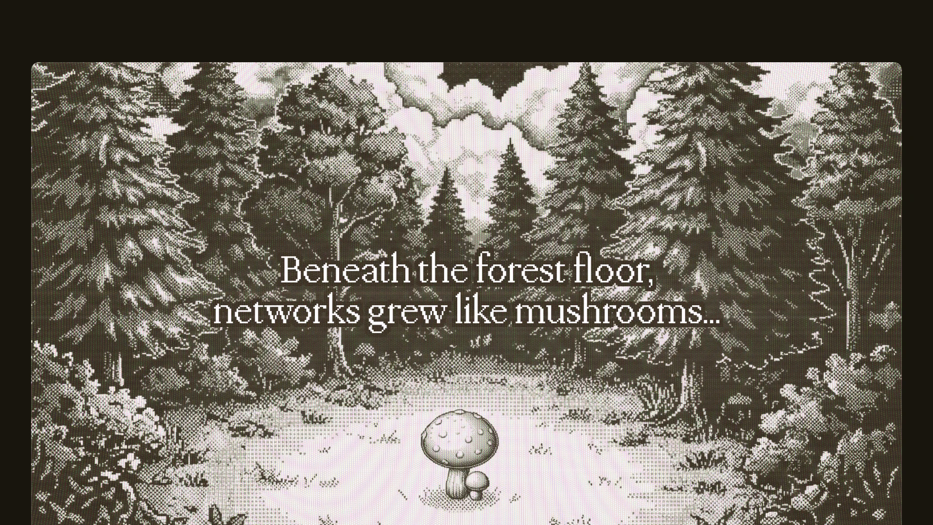
So we went somewhere unexpected: Iterated profusely, chased multiple directions, and via an exploration into mycelular pixel art, landed on exploiting the visual heritage of vintage gaming to appeal Overmind to their deserving audience. It was part-stylistic flourish, but also a deliberate appeal to a particular tinge of nostalgia.
Pixel perfect, but not in the usual way
When we looked to craft assets for the Overmind brand — large parts of which were still immaterial as their product was in development — there was a beautiful sense of systemisation to our pixel artwork which aligned nicely with similar hard-edged technology brands, without losing an element of engrained personality.

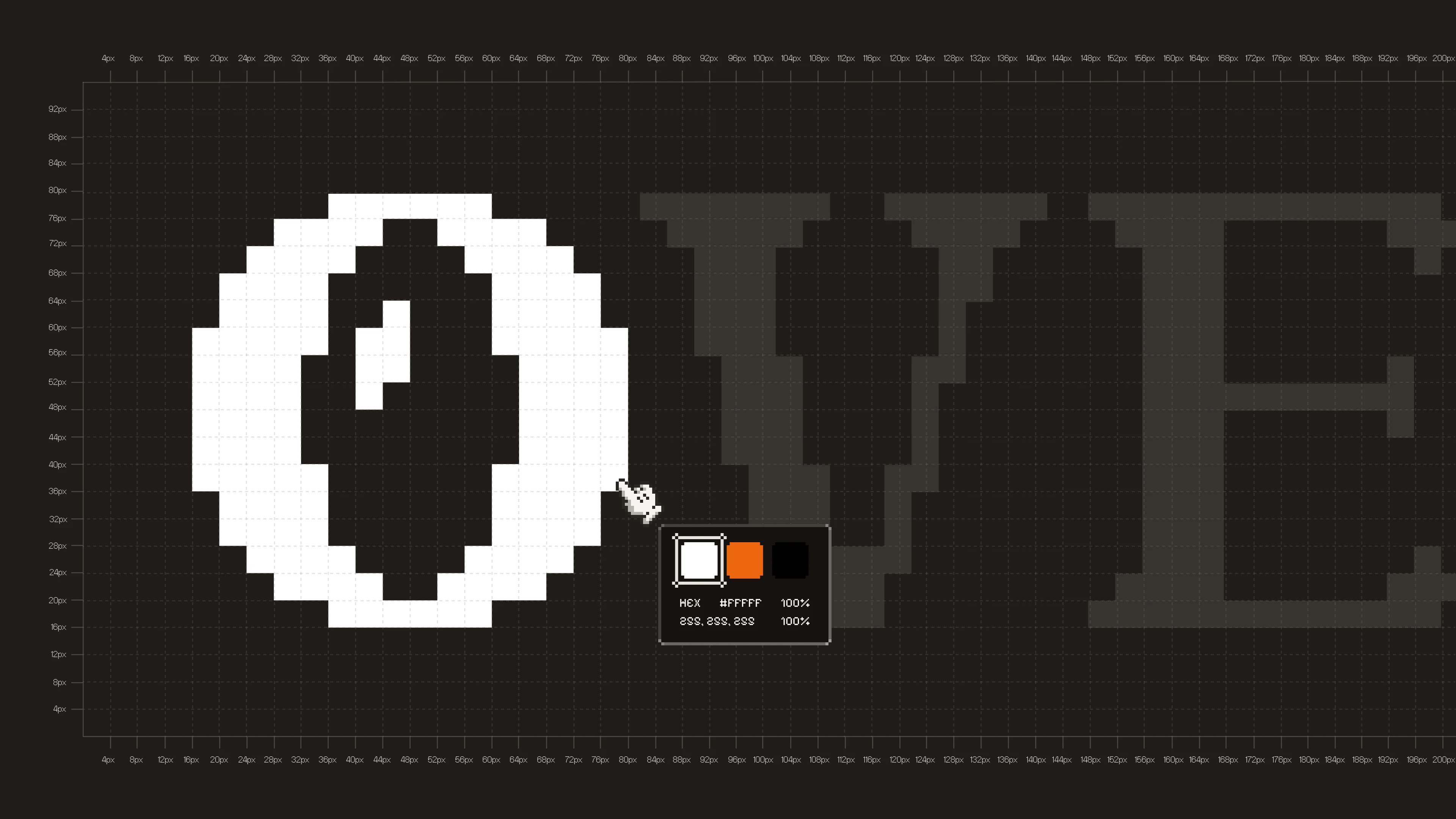
We resisted minimalism on principle. Every touchpoint was saturated — rich, textured imagery, custom pixel-art icons, interactions that click and scroll with the tactile resistance of a physical gamepad. There was a joy in the conscious refusal of the "global neutral" that so much B2B software defaults to: the assumption that authority requires restraint and that seriousness must look austere. We just didn’t believe that (and thankfully neither did the Overmind team). So we proceeded to build a brand with visual friction at the core — something that resists being scrolled past, that asks a half-second more of attention than the category typically commands.
Shaping an origin story
There's a particular satisfaction in work that doesn't just dress up an existing idea, but gives shape to one still forming. Overmind's category of agentic observability and of AI teams “building the infrastructure to understand their own systems” is a category still being written — which of course is a real privilege when working with them, knowing that they're among the people defining what it means.
The identity we built isn't simply a coat of paint over an existing platform; it's a toolkit that the Overmind team now carry proudly into rooms with investors, into conversations with the developer community, into whatever this category becomes over the next several years. Brand, at its best, is stewardship of something overly specific rather than decoration of something generic — and what's specific here is a genuinely new way of approaching brand design projects — with a fully blank canvas and open mind.
We're grateful to Tyler and Sam for the trust, the openness, and the willingness to build something truly crazy with us.